Most Comprehensive Paleoclimate Reconstruction Confirms Hockey Stick
By Stefan Rahmstorf via Scilogs: The results reveal interesting regional differences between the different continents, but also important common trends. The global average of the new reconstruction looks like a twin of the original “hockey stick”, the first such reconstruction published fifteen years ago.
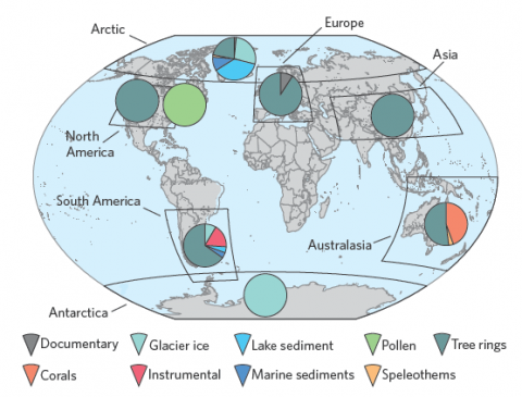
78 researchers from 24 countries, together with many other colleagues, worked for seven years in the PAGES 2k project on the new climate reconstruction. “2k” stands for the last 2000 years, while PAGES stands for the Past Global Changes program launched in 1991. Recently, their new study was published in Nature Geoscience. It is based on 511 climate archives from around the world, from sediments, ice cores, tree rings, corals, stalagmites, pollen or historical documents and measurements (Fig. 1). All data are freely available.

The map gives an overview of the studied continental areas and the particular combination of the proxies obtained.
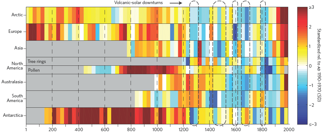
The climate history of the past 2,000 years was reconstructed for seven continental regions in 30-year intervals (below Figure).

Temperature evolution of the individual continental regions (30-year average). Red means hot, blue is cold.
Source: Nature Geoscience.
Regional climate evolution
The data show, as expected, significant regional differences. Such regional patterns are an important clue to the causes and mechanisms of climate change. Significant local variations in climate can occur through changes in the atmospheric or oceanic circulation patterns, with very little effect on global mean temperature, because heat is only distributed differently (a recent short-term example is the record cold March in parts of Europe while Greenland was extremely warm – nothing unusual happened in the global mean). Changes in global mean temperature, however, occur due to changes in radiative forcing (eg solar fluctuations). This forcing can be globally uniform (e.g. well-mixed greenhouse gases) or can have a regional pattern (for example, volcanic eruptions and orbital cycles). So in the individual continents one expects a response to the forcings, superimposed by internal fluctuations.
The data shown in Figure 2 reflect this: they show some coherent signals, especially a long-term cooling trend that leads to increasingly cooler climate conditions from the relatively warm Middle Ages until this is turned around in the late 19th Century (see the next section). But, as expected, some regional variability is superimposed, especially on shorter time scales of decades to a century, where particularly warm and cold phases do not coincide in their timing on different continents, as the authors emphasize in the abstract:
There were no globally synchronous multi-decadal hot or cold intervals that define a worldwide Medieval Warm Period or Little Ice Age.
But they identify some shorter intervals where extremely cold conditions coincide with major volcanic eruptions and / or solar minima (as already known from previous studies).
Global Trends
The global mean temperature is of particular interest because it is a direct response to the global radiative forcing, buffered by the thermal inertia of the oceans. This follows from the first law of thermodynamics, i.e. the law of conservation of energy. So the globally coherent signals indicate globally effective forcings. The authors write in the abstract:
The most coherent feature in nearly all of the regional temperature reconstructions is a long-term cooling trend, which ended late in the nineteenth century. (…) Recent warming reversed the long-term cooling; during the period ad 1971–2000, the area-weighted average reconstructed temperature was higher than any other time in nearly 1,400 years.
The following Figure 3 therefore compares the area-weighted mean over the continents (b) with some previous northern hemisphere reconstructions (a) and the forcings (f, g, h). The basic pattern – a long-term slow cooling which in the late 19th Century turns into a rapid warming – has been known for 15 years and is often compared to a hockey stick: the long cooling trend is the handle, the modern warming the angled blade.
Image (Figure 3 click to enlarge).
Comparison with the forcings shows that this blade is due to the radiative forcing from the increasing amount of greenhouse gases in the atmosphere (green line in g). The solar and volcanic forcing can be reconstructed only with some uncertainty, therefore two variants are shown. For solar forcing, it is less the shape of the curve but mainly the amplitude which is controversial (a constant conversion factor) – the very high amplitude adopted by Shapiro (dotted line) is widely regarded as highly questionable (see, eg, Feulner and Judge et al ). But even with this extreme assumption, the solar forcing in the 20th Century cannot compete by far with the greenhouse gases, and it also does not match the temperature evolution.
Interesting especially on long time scales of thousands of years is the orbital forcing (the well-known Milanković cycles; here is an online calculator for the radiative forcing). In the north, especially the summer insolation is important (green curve in panel h), because it is greatly amplified by the albedo feedback (ie, by changes in the ice and snow-covered area). This may explain part of the cooling trend in the Northern Hemisphere. In Antarctica the situation is different: in summer the ice-covered area is relatively constant at about the size of the Antarctic continent, because there is little sea ice, and the trend of solar radiation (blue curve in panel h) is relatively weak. Therefore the summer insolation change is much less important. But the annual average insolation in Antarctica (not shown in the PAGES graph) has declined strongly due to the orbital cycles over the past two millennia. This could be the explanation for the long-term cooling in Antarctica, which (unlike in the global average) has not yet been made up for by the modern anthropogenic warming.
Climate models are computer programs that calculate climate evolution from such forcings, based on the equations of thermo-and hydrodynamics. In the last IPCC report 18 such model calculations for the last millennium by different research groups are listed, almost all of which reproduce the reconstructed climate history from proxy data reasonably well (see IPCC, Figs. 6.13 and 6.14 – the red-dashed outlier in 6.13 is the drift-affected model used by von Storch et al. in their failed attempt to discredit Mann et al.). The models also show that without the anthropogenic forcing there would have been no warming in the last 150 years.
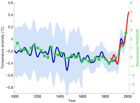
The first comparable hockey stick curve was published in 1998 and 1999 by Mann et al. – at that time based on data only from the northern hemisphere. Figure 4 compares the new hockey stick (from panel b in Figure 3) with this original hockey stick. (The data for the original hockey stick have also been available since 1999 on the NOAA Paleoclimatology website.)

Green dots show the 30-year average of the new PAGES 2k reconstruction.
Green dots show the 30-year average (area-weighted mean over the continents) of the new PAGES 2k reconstruction, as shown in Figure 3b. The red curve shows the global mean temperature, according HadCRUT4 data from 1850 onwards (also in Figure 3b, smoothed with a 30-year window). In blue is the original hockey stick of man, Bradley and Hughes (1999) with its uncertainty range (light blue). Graph by Klaus Bitterman.
For the scientific community, the confirmation of the old hockey stick is no surprise (except perhaps for the closeness of the match); many other climate reconstructions with a similar time evolution have already appeared since. Mann et al. at the time cautiously assumed a wide margin of uncertainty (light blue) because of their limited data base and a possible underestimation of the variance by their method; later reconstructions run largely within this margin.
The work of Mann and colleagues has gained the highest recognition. For example, Bradley was honoured in 2007 with the Oeschger Medal of the European Geosciences Union and Mann likewise in 2012, and both were (as well as Hughes) elected as fellows of the American Geophysical Union. Politically motivated attacks on their work were immense, however – both Bradley and Mann have published books about that experience:
- The Hockey Stick and the Climate Wars: Dispatches from the Front Lines by Michael E. Mann
- Global Warming and Political Intimidation: How Politicians Cracked Down on Scientists As the Earth Heated Up by Raymond S. Bradley
Stefan Rahmstorf is Co-Chair of Earth System Analysis, Potsdam Institute for Climate Impact Research. This article was originally published in German and translated by the author.
About the Author: CLIMATE STATE
POPULAR
COMMENTS
- The risk with the path to a hothouse Earth | Climate State on Climate Tipping Points Existential Threat to Our Life Support Systems
- Robert Schreib on Electricity generation prices may increase by as much as 50% if only based on coal and gas
- Robert Schreib on China made a historic commitment to reduce its emissions of greenhouse gases
- Lee Nikki on COP30: Climate Summit 2025 – Intro Climate Action Event
- Hollie Bailey on Leaders doubled down on fossil fuels after promising to reduce climate pollution